Inky Play Friday: Let’s get started…

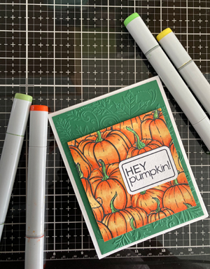
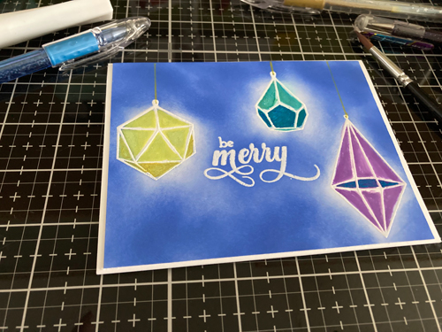
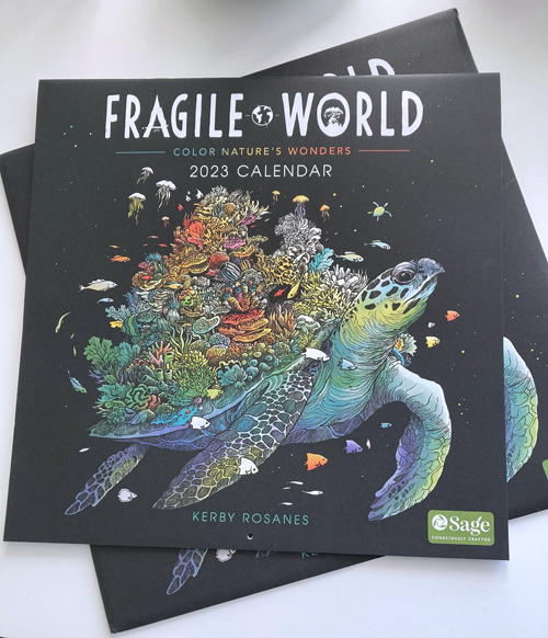
Hello and happy Friday! It’s my favorite day of the week. It’s cold but super sunny in my craft room this morning. Just the perfect day to work on a custom order for Belinda’s Crafts and then dive back into this beauty I got for Christmas. It’s a coloring calendar of one of my favorite coloring book artists, Kerby Rosanes. I own several of his coloring books this is one of my favorites. In addition to this calendar, it comes in a regular coloring book format with bonus pages that explain why each of the animals are endangered species. So it’s not just theraputic it’s educational.

I decided one way to ensure I make time to color is this monthly calendar. So each month I am challenging myself to complete each month’s page. I am also challenging myself to use different mediums and different pencils on the pages.

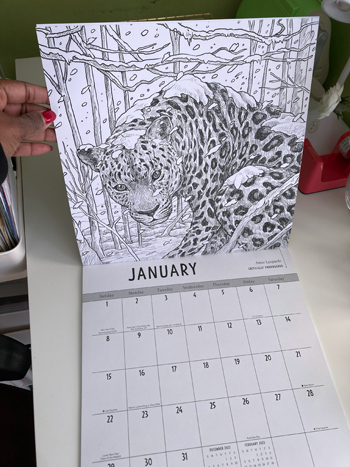
The book says that this is snow leopard and that they are found in the high mountain ranges of Central Asia. Their main threat is the expansion of human settlement. Poaching and climate change also threatens their chance for survival.

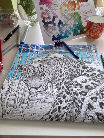
I grabbed my Copics and started by basing the sky with them. However, they are bleeding through so I won’t use them again. I will test out my Tombows to see if they can work. It will save me a lot of time and I can simply use my colored pencils over the top for shading.

The World Wildlife Fund (WWF) is taking steps to help the snow leopard thrive again. If you want to learn more about his very important animal, check out what they are doing.

https://www.worldwildlife.org/species/snow-leopard

Have a lovely weekend my friends!

InkyPlayFriday: Swatching my new watecolor paint set

My new Kuretake watercolor paints

I bought my first set of Kuretake watercolor paints a couple years ago and although I loved them, I didn’t use them often. Back in November, I saw all the buzz about them coming out with a new watercolor set. What I realized is that for a beginner what motivates me to use something is the colors. The first set had more basic colors and as a beginner that doesn’t know how to make my own colors, it was daunting and I didn’t feel motivated to use the old one. Fast forward to December when I saw the color pallette in the new release, I was so excited I pre-ordered them and patiently waited.

I found this great stamp set to use to swatch my paints.

Because this year, I plan on exploring with paints, I have been watching videos and even purchased a couple books to get me started. One video I saw these great stamps to add some fun to swatching my paints. As a big believer in swatching, I swatch all of my coloring supplies. (I’m actually a little behind with all of my recent purchases.) I use my swatch charts of my Copic Markers, Prismacolor and Derwent pencils every time I work on a project. So it is important to me to create a swatch for this paint set to set myself up for success.

Choosing which stamps to use.

This stamp set has really fun stamps to swatch. I plan on trying them all, over the course of the year. This new set has 24 colors and and since I am using this small block watercolor paper pad to create my swatch chart, I think the smaller vertical set of 6 boxes to create my chart.

Laying out the stamps to see if they fit.

What’s the saying “Measure twice cut once.” or something like that. Since I don’t want to waste the paper, I lay out the stamps to see if I can fit them all on the page before commiting to ink and stamping.

All finished stamping.

Eventhough the ink dries fast,I still let it sit for a few minutes before I begin painting. This ink is perfect to use with watercolors.

A little tea while I paint.

I am liking the colors a lot. I definitely can see several that I naturally gravitate to. The computer does not do the colors justice. I am also using a new brush set. This one is pretty nice. Well based on my beginner knowledge, I like the way they feel in my hand.

All finished.

I like seeing the damp papertowel while I work with all the colors blending. I have to let go of my need to clean and enjoy the unexpected with painting.

Done!

There is something so satisfying about looking at completed swatch charts and seeing all the colors. It was especially fun to swatch the darker ones to see what they would look like on paper. Some of them were such a pleasant surprise.

Next I am going to begin reading the book I have and try one of the exercises.

Have a lovely weekend!

Inky Play Friday – Playin’ with my Copics!

Happy Inky Play Friday! I set my distress inks aside for a Copic coloring session. I have this fantastic stamp of a grouping of pumpkins that I bought earlier this year. Autumn makes me think of fluffy blankets, beautiful tea mugs, and pumpkins. We used to carve pumpkins when my boys were younger but as they have lost interest, I moved on to baking with pumpkins. I have a yummy pumpkin cookie recipe that totally fills the house with an amazing aroma.

After stamping the images and letting them dry, I went on my Silhouette and designed then print and cut the sentiments so I can use these on some cards. I printed it in a couple of different colors so that I could have options.

I love finding color combinations for things in nature. I went onto Pinterest to look for pumpkin pictures and to see what color combinations I could find before coloring them. The contrast in this inky play versus the distress inks is so pronounced. When I use the distress inks there is less precision and a lot of random results but with my Copics, I can control the color better. Some days it’s nice to have more control but I am loving stretching my comfort zone with less predictable mediums.

Next, I used a really cool leaf embossing folder to create a dimensional backdrop for the pumpkin display. I decided to create them in a couple of different colors to see how it changes the mood of the cards.

I used my dimensional dots to raise the pumpkin image on the front of the card. They are so much fun to use and they really made the image pop.

I am going to continue to color some more today and try out the different backgrounds.

Have a wonderful weekend!

Inky Play Friday – Painting with Distress Inks

It’s that time…time to play with some inks! Today I am painting with Distress Oxide ink pads. I am always so inspired to craft when I watch craft videos on YouTube. I have been really into my oxide ink pads for the past few months so I have been watching videos where crafters are using them in a variety of ways.

The first thing I did was select some coordinating colors that would look nice on the blue background. Then I heat embossed the ornaments and sentiment with white embossing powder. Then I applied blueprint sketch color onto the back. At first, I was going for a solid background then I started to like the way the lighter areas almost looked like a glowing effect and left it.

Next, was the fun part – painting with the ink. So I rubbed a bit of twisted citron onto my glass mat, gave it a few squirts of water, and then painted the first ornament. It was so relaxing and easy because the embossing keeps your color right where it’s supposed to be. If you haven’t painted with your Distress ink pads, you really should, it’s very fun.

For the first card, I drew the strings with a sparkle pop pen and then used Wink of Stella to give the ornaments a hint of shimmer.

For the second card, I searched my stash for coordinating glitter pens to color in some of the ornaments for a cool contrast.

Here is a close-up so you can see the glitter pens on the second card. I love how they came out. It reminds me of old-fashioned glass ornaments my mother used to hang on the Christmas tree.

I will be sure to incorporate these techniques in future cards because it was really fun.

Have a wonderful weekend!

Follow

Get every new post delivered to your Inbox

Join other followers: