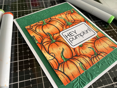
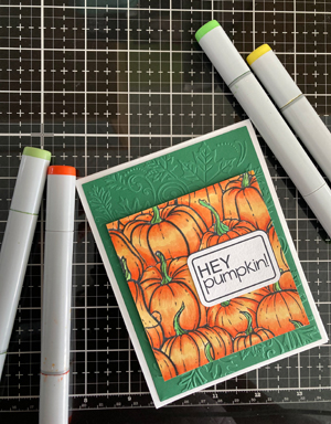
Happy Inky Play Friday! I set my distress inks aside for a Copic coloring session. I have this fantastic stamp of a grouping of pumpkins that I bought earlier this year. Autumn makes me think of fluffy blankets, beautiful tea mugs, and pumpkins. We used to carve pumpkins when my boys were younger but as they have lost interest, I moved on to baking with pumpkins. I have a yummy pumpkin cookie recipe that totally fills the house with an amazing aroma.

After stamping the images and letting them dry, I went on my Silhouette and designed then print and cut the sentiments so I can use these on some cards. I printed it in a couple of different colors so that I could have options.
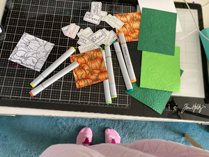
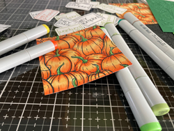
I love finding color combinations for things in nature. I went onto Pinterest to look for pumpkin pictures and to see what color combinations I could find before coloring them. The contrast in this inky play versus the distress inks is so pronounced. When I use the distress inks there is less precision and a lot of random results but with my Copics, I can control the color better. Some days it’s nice to have more control but I am loving stretching my comfort zone with less predictable mediums.
Next, I used a really cool leaf embossing folder to create a dimensional backdrop for the pumpkin display. I decided to create them in a couple of different colors to see how it changes the mood of the cards.
I used my dimensional dots to raise the pumpkin image on the front of the card. They are so much fun to use and they really made the image pop.
I am going to continue to color some more today and try out the different backgrounds.
Have a wonderful weekend!


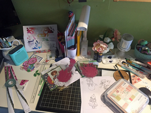 Good morning my crafty WOYWW friends! For those of you that aren’t familiar with WOYWW (What’s On Your Workdesk Wednesday), head on over to
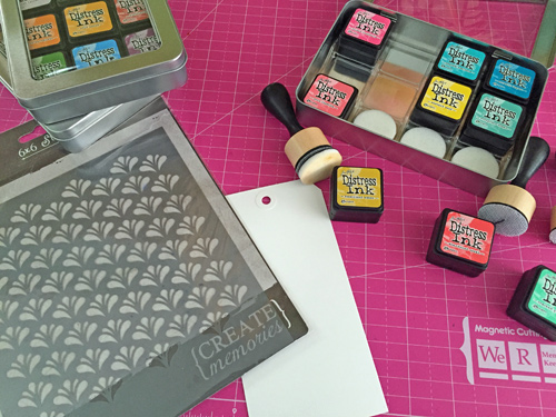 I pulled out my distress inks, cardstock tag, a stencil, a digital stamp and my Copics to create my day 30 project. I have had these tags around for a long time and this seemed like the right time to break one out and use it as a base for the project.
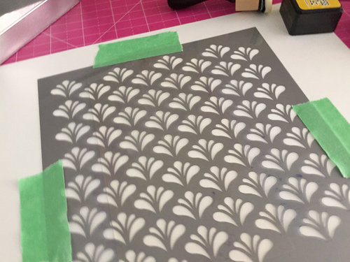 I taped the stencil down so that it wouldn’t move while I put down the distress inks. I selected three colors: Cracked pistachio, fossilized amber, and abandoned coral.
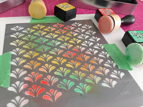 I love how these colors blend and compliment each other. They definitely remind me of Easter so I think it was a perfect selection for the digital stamp I selected.
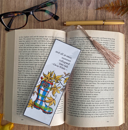
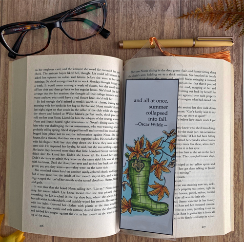
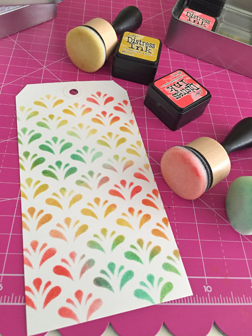 When I removed the stencil I just loved the result. Apollo happened to be in the room and said he wanted me to make an additional one he could use for a bookmark. What a pretty bookmark this makes too.
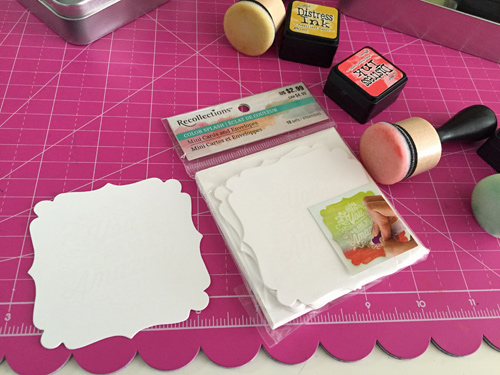 I also grabbed this mini card set from my recent Michael’s Haul from the Recollections’ Color splash line. It already had the sentiment on it so all I needed to do was add color. So I used the same three distress inks.
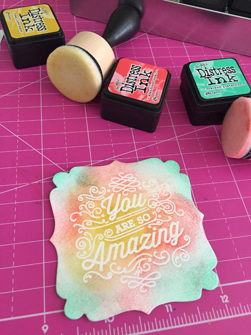 I love that I can use the distress inks on these products too.
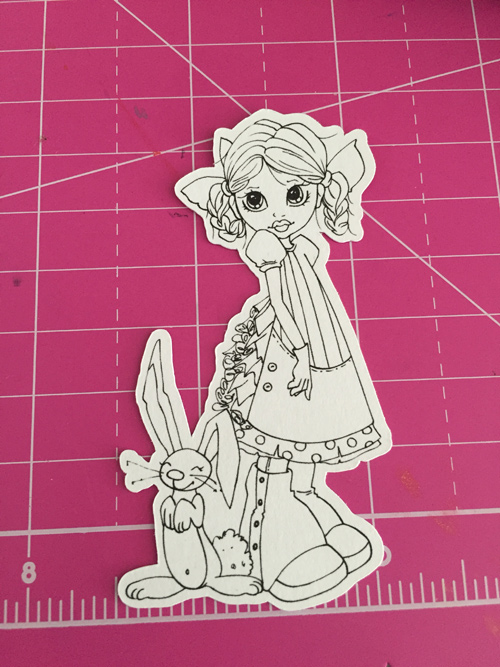 I picked this Saturated Canary digital stamp to add to the project. I had this already cut out. I often cut digital stamps out in varying sizes so that I can use them on different projects so this one was the perfect size for a tag.
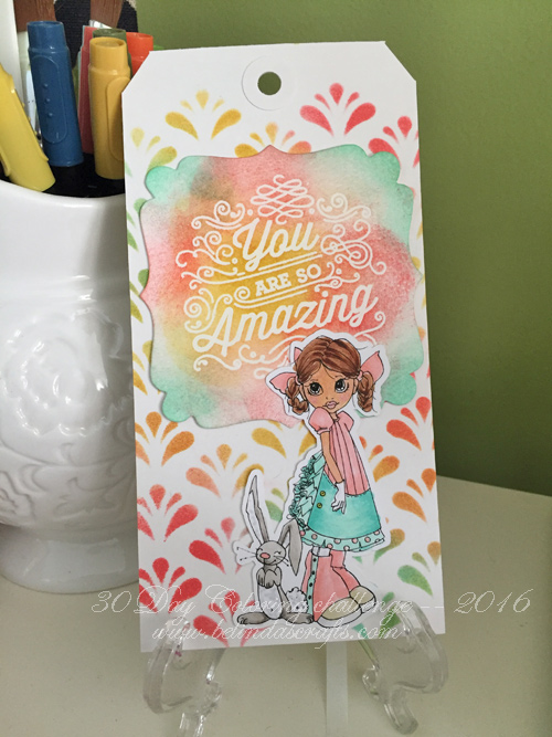 I used my Hex Chart to find coordinating colors in my Copics stash to use to color her up. The final product came out so cute. It’s a vary happy tag and makes me think of spring, Easter and joy!