 Hello Everyone! It’s day 6 of the coloring challenge. Today I was able to complete the image I started coloring yesterday and make a card.
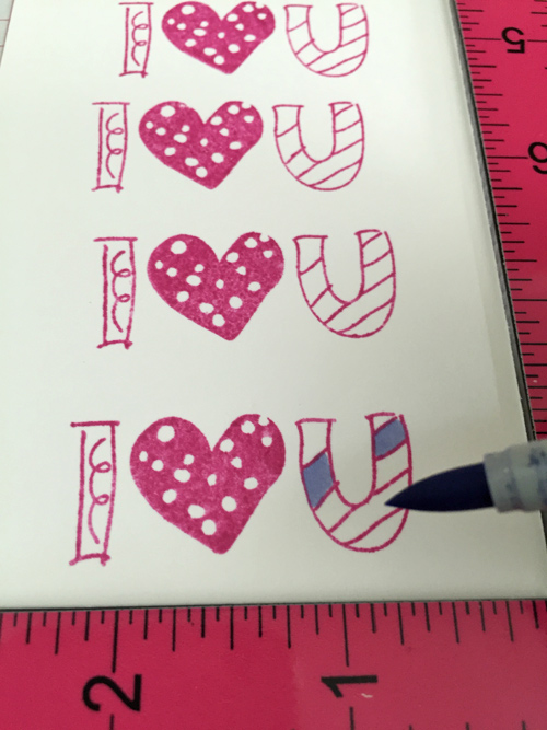 I picked one of the stamps out of the Basic Grey ‘Amour’ stamp set and used my MISTI to stamp it. I used a coordinating Memento ink called Lilac Posies to stamp it and then I used my Copic to color in part of the I and U. I like that the sentiment looks hand-drawn.
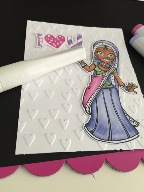
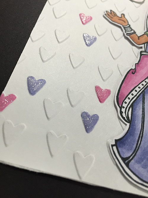
Then I used the Cuttlebug embossing folder ‘Cross My Heart’ and embossed a white piece of cardstock. I took two of the Copics I used on her to color in random hearts and then colored clear Wink of Stella so they would sparkle!
 I am loving this color combination and stamped up a few more sentiments in the same color so I can make a few more cards like this.
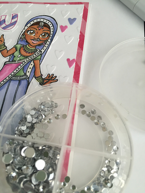
I added a gemstone for her head adornment from my old stash.
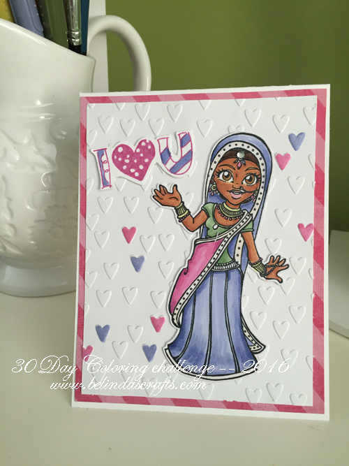 It’s a fun and the colors are bright and cheerful. I hope you have time to squeeze in some coloring. I am so happy I did. See you tomorrow!
Happy coloring!

 So my schedule has been shaken up a bit to say the least. I did manage to pick out an image to color. It is this beauty from MayzyArt’s digital images. I chose this gemstone pack as my color inspiration.
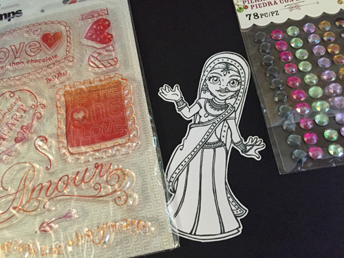 I would also like to use this really pretty love sentiment stamps from Basic Grey. You know, I only realized while writing this post that I picked another Basic Grey product. Very funny.
 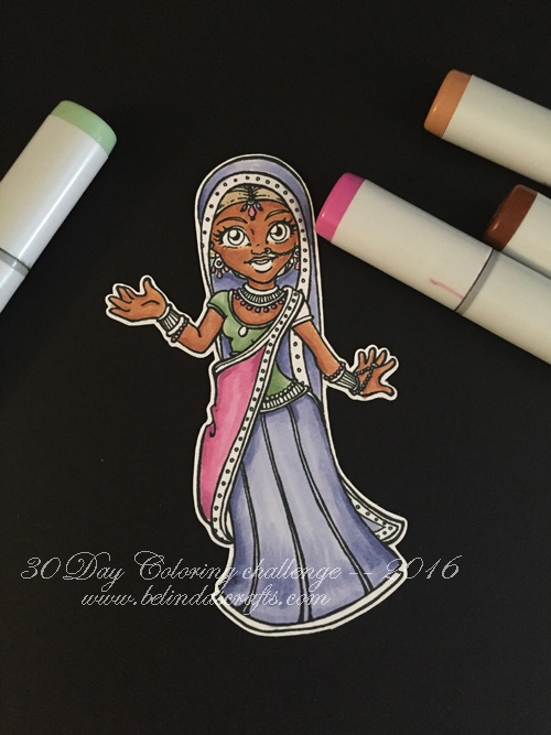 I used my copics and colored her up. (Just realized I didn’t color her right sleeve!) I still need to complete some of the coloring before tackling the card, but I am afraid that is all I can do today. I need to go shovel, make lunch for the boys and enjoy the rest of this extra day I get to have them home. So I apologize for no completed project but I will share once I complete it.
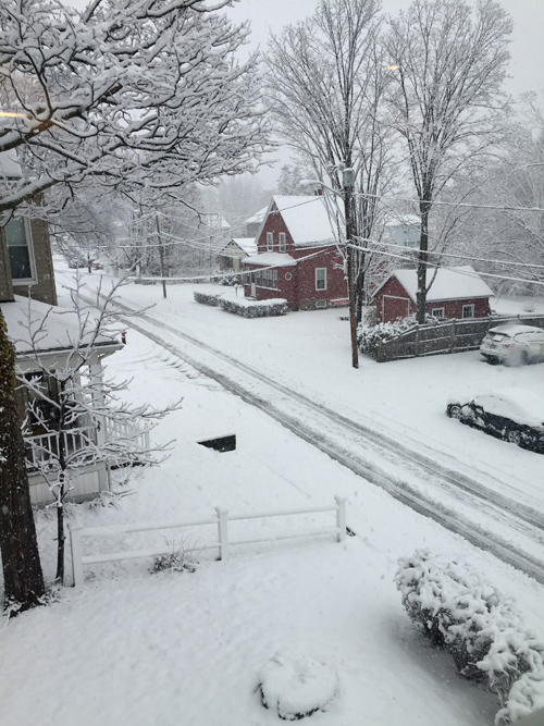
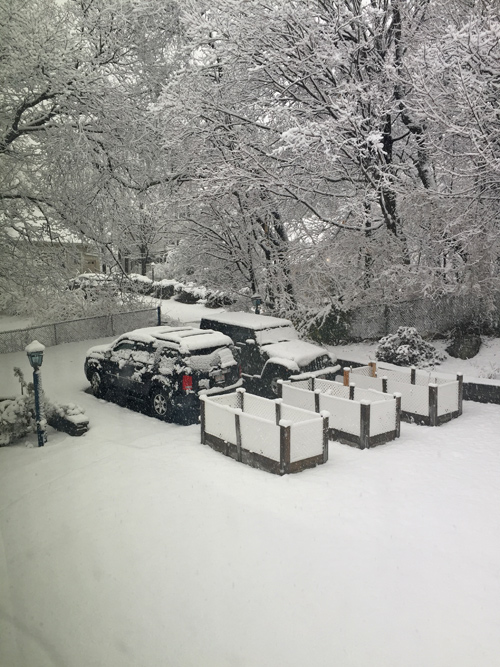 I want to get out there and shovel before it gets dark. This is our totals so far however this storm has many more hours to go!!
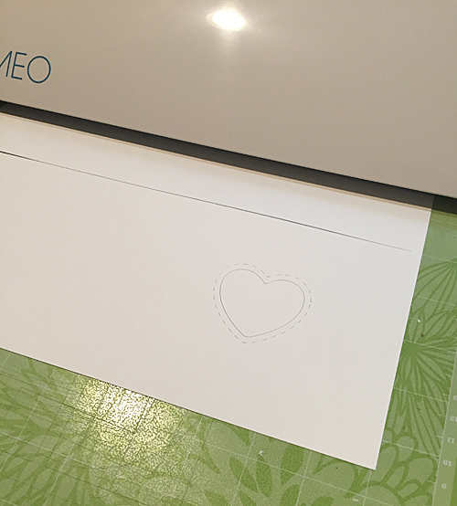
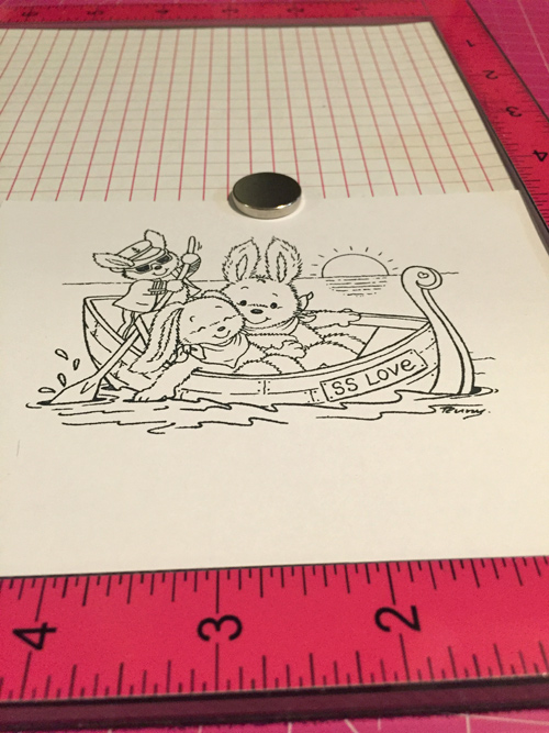 I used my Misti to align the image properly with the heart window before I stamped it on my XpressIt paper.
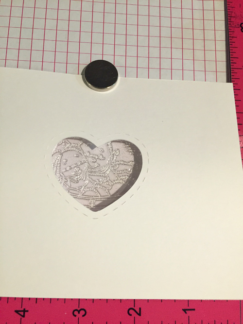 Then I stamped up the image and made a few extra for future cards.
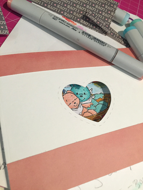 I decided to add pattern paper from Carta Bella’s ‘ Words of Love collection to the front of the card because it was to bare and I didn’t feel like stamping a sentiment on the front so I chose a pattern paper with words. I first added to complimentary colored strips from Basic Grey’s True Love collection to the front of the card to add further dimension.
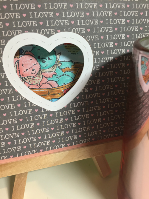 I really love the stitching so when I created another file to cut out a heart window for the front, I enlarged it so that you will still see the beautiful stitch lines. I love when I make files like this because I can use them over and over for different projects.
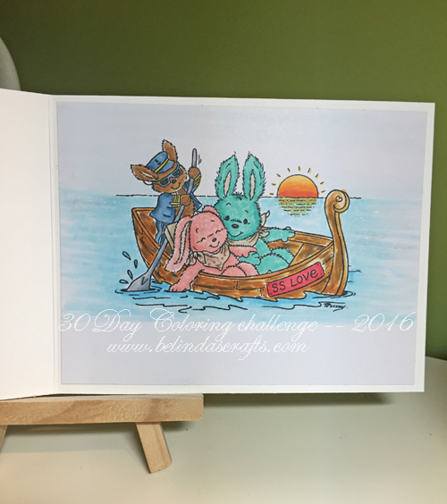 I colored up the image with my Copics and tried out a new color combo for the wood on the boat. This image provided me with another opportunity to work on this technique. It was also my first sunset. Something I will continue to practice moving forward. I used clear Wink of Stella on the water for shimmer.
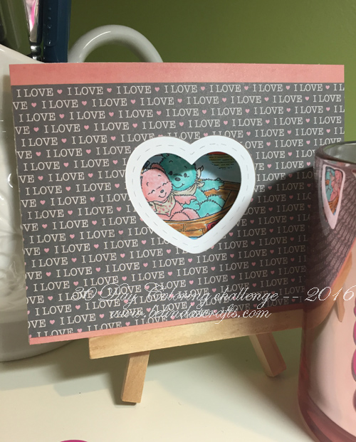 Overall, I like how it came out. I hope you are having a great day! I am glad I didn’t listen to that voice so I had time to play with my markers.
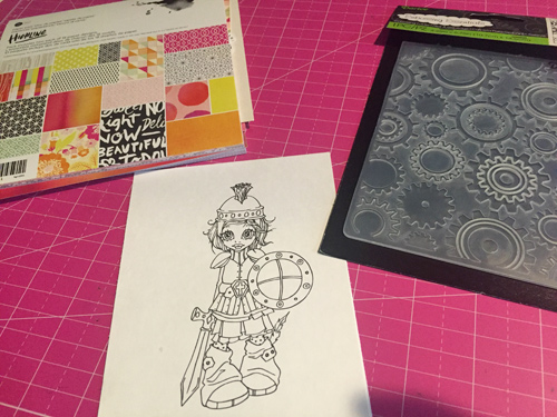 I used another Saturated Canary digi for today’s card. As I mentioned in reply to a comment yesterday, some days I struggle with sentiments. I thought I wanted to use the ‘Fight Like a Girl’ sentiment commonly used on Breast Cancer cards and could not locate my stamp. So instead of eating up time in the search, I decided to color then worry about that.
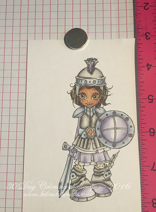 I colored her up with my Copics with muted colors to practice creating the metallic look. But in the future I would like to try something vibrant and funky. This is the year of experimenting and getting out of my comfort zone so I will share when I give it a try.
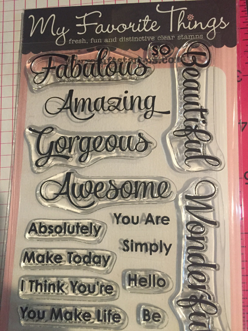 I love this sentiments stamp set from My Favorite Things and decided I could use this on my card.
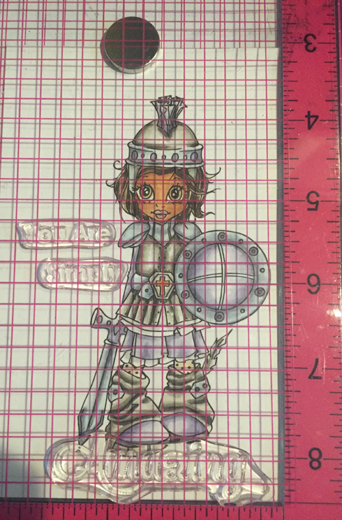 I used my MISTI tool to align the words where I wanted them. I ended up deciding to overlap some of the words across the image so I inked it and stamped a few times for a dark impression. Normally I wouldn’t do this but I wanted to see how it would look. I like the overlap on the ‘Amazing’ but not as much on the ‘are’.
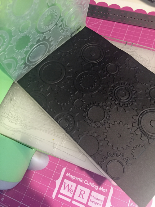
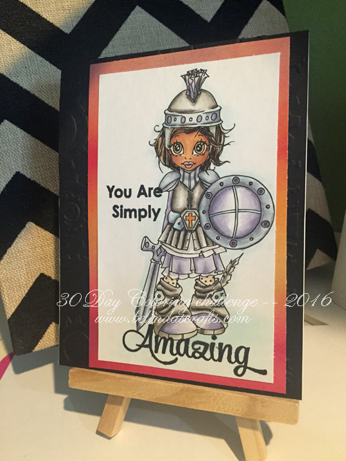 I cut down the image and matted it on the Basic Grey paper and attached it the embossed cardstock. I love how I can’t help touch the gears when I hold this card.
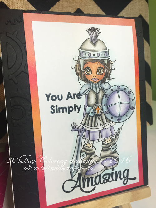 This angle you can see the gears better. One thing I will do next time is wait longer after I color the light blue on the bottom of the card because it caused the ‘z’ to blur a little. (yup, self-critic can’t help herself!).