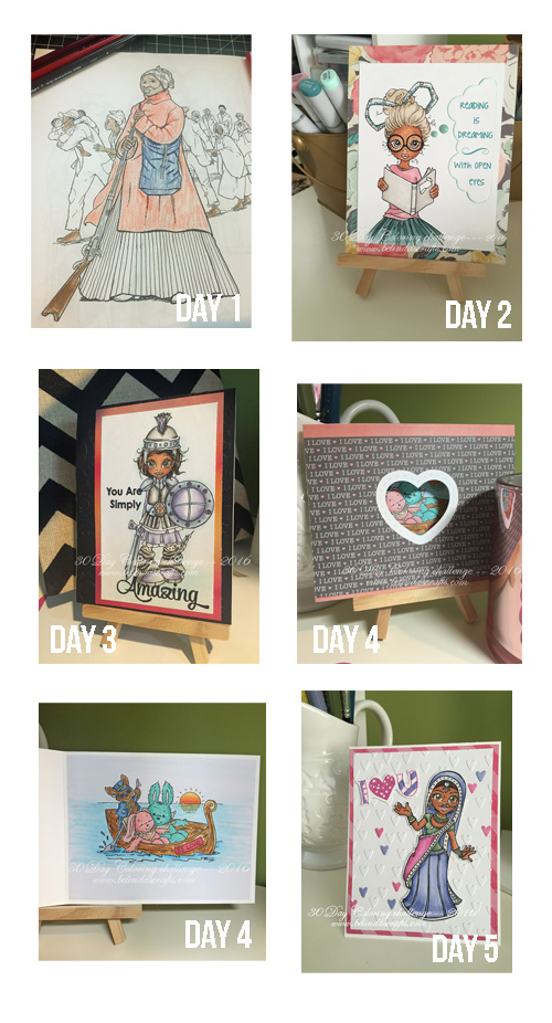
Over the course of 30 days I used color pencils, Copic markers, watercolor crayons, distress inks, watercolor paints to color.
 I really had fun playing and not feeling any pressure for perfection.
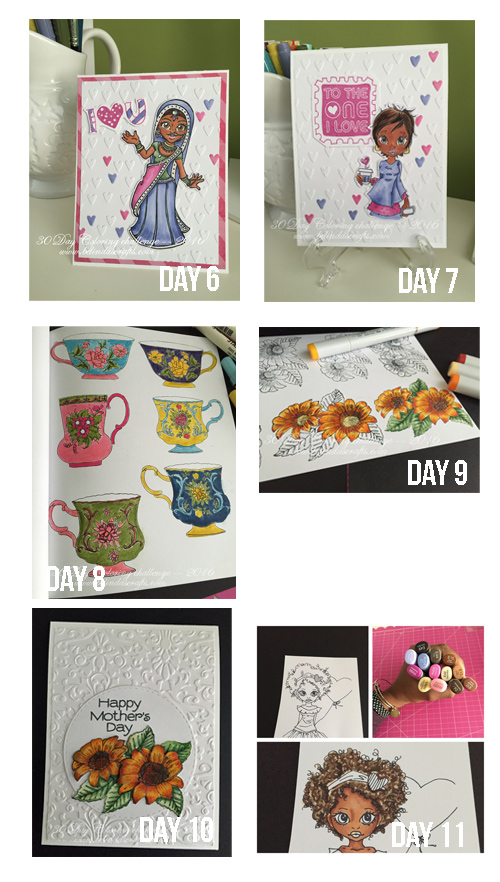
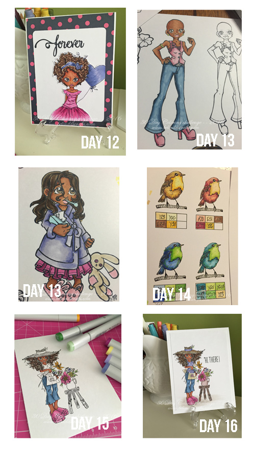 I was happy to break out stamps and products I never used before that have been hanging around my craft room.
 I loved re-acquainting myself with my embossing folders. They are such a great tool to have and add so much dimension to the cards.
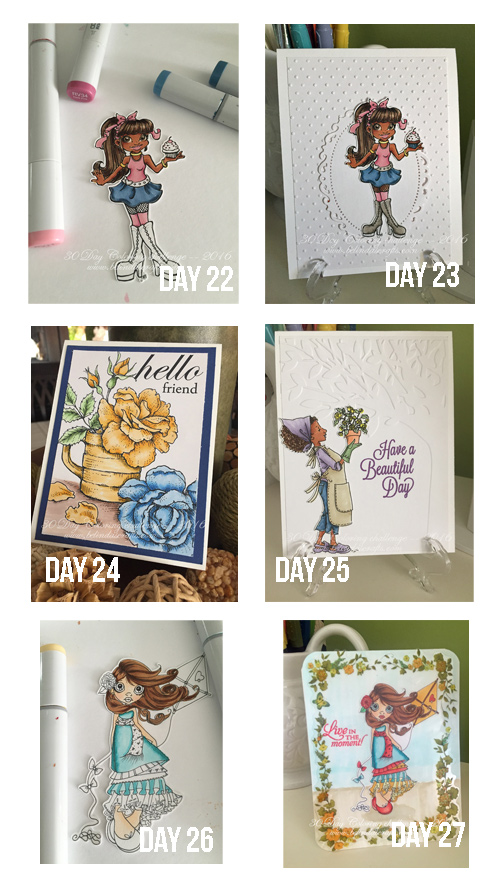 Finally using my coloring books makes me feel less guilty for purchasing them on impulse.
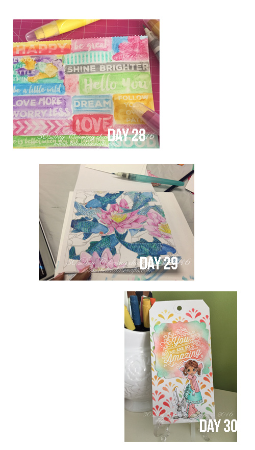 I hope you had fun hanging out with me for this challenge. Your sweet comments helped to keep me going so thank you.
Now I have all these lovely projects to look at.
Happy coloring my friends.
Belinda

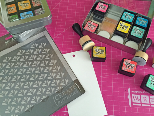 I pulled out my distress inks, cardstock tag, a stencil, a digital stamp and my Copics to create my day 30 project. I have had these tags around for a long time and this seemed like the right time to break one out and use it as a base for the project.
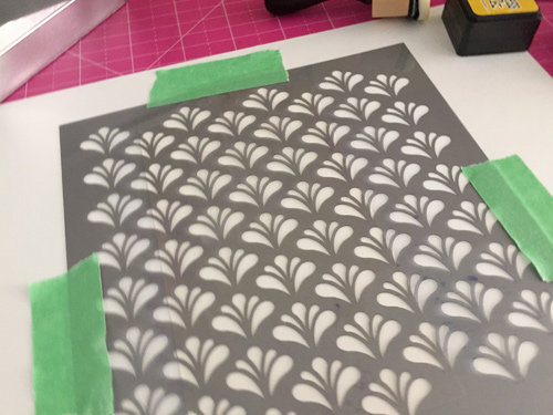 I taped the stencil down so that it wouldn’t move while I put down the distress inks. I selected three colors: Cracked pistachio, fossilized amber, and abandoned coral.
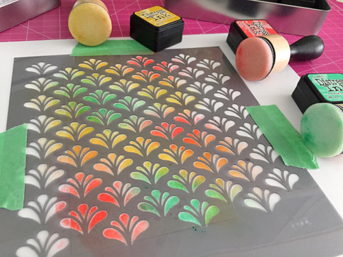 I love how these colors blend and compliment each other. They definitely remind me of Easter so I think it was a perfect selection for the digital stamp I selected.
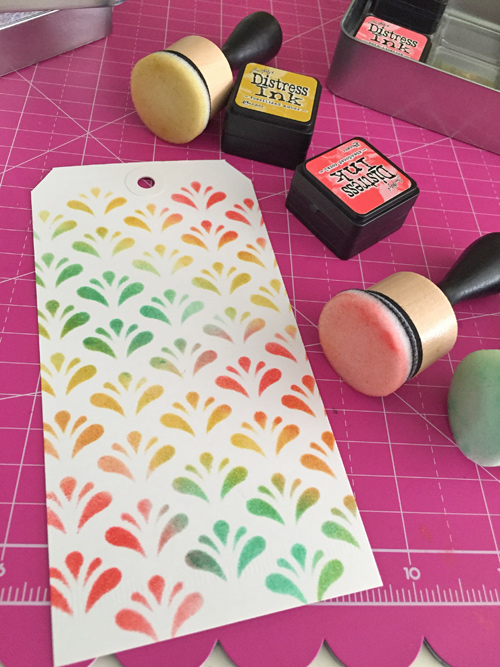 When I removed the stencil I just loved the result. Apollo happened to be in the room and said he wanted me to make an additional one he could use for a bookmark. What a pretty bookmark this makes too.
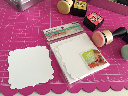 I also grabbed this mini card set from my recent Michael’s Haul from the Recollections’ Color splash line. It already had the sentiment on it so all I needed to do was add color. So I used the same three distress inks.
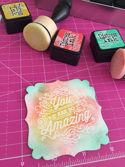 I love that I can use the distress inks on these products too.
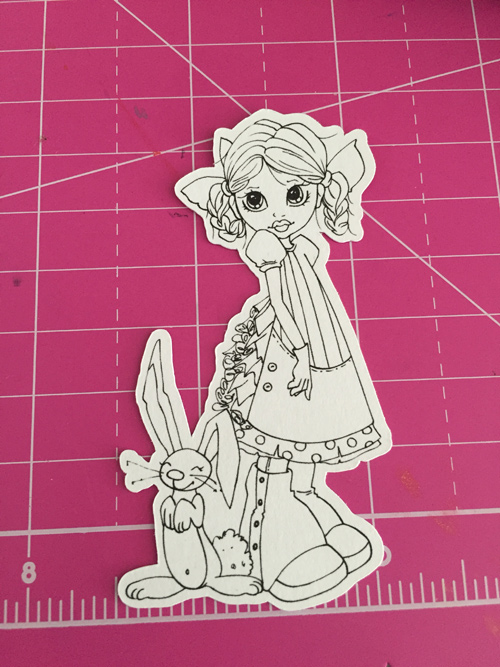 I picked this Saturated Canary digital stamp to add to the project. I had this already cut out. I often cut digital stamps out in varying sizes so that I can use them on different projects so this one was the perfect size for a tag.
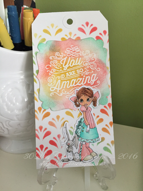 I used my Hex Chart to find coordinating colors in my Copics stash to use to color her up. The final product came out so cute. It’s a vary happy tag and makes me think of spring, Easter and joy!
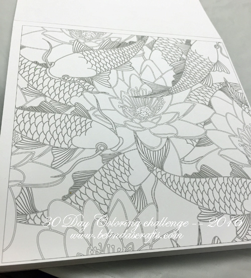
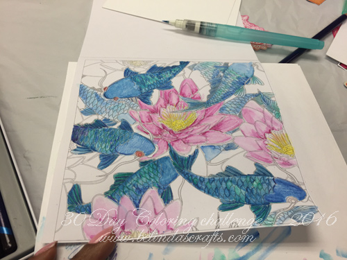 I took a page out of one of my coloring books and used my Inktense water color pencils to color it in. I used my waterbrush because it was small. I definitely feel like I need to keep practicing so that I can get the colors to blend better and learn to control the color better.
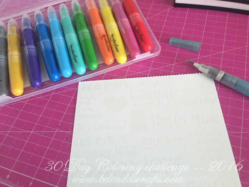 I used one of the sheet from the Color Splash 6×6 pad. I first colored a bit and then used my water brush to activate the watercolor effects. My first impression is that the crayons are thick so fine detail coloring is out of the question. The other is the texture of the crayons were more like a lipstick – creamy. So they are very soft so they don’t require you to press down too hard. If I want the color darker I would have to apply more pressure and then when I added water they would produce a vibrant color. I have to say I love the colors they selected for this set. The aqua, gold, green and pink were my favorite.
 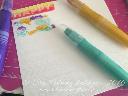 They have predesigned images on the pages so once you color them the images would resist the paint. I thought this one would be fun to color and then cut them up to use in my Project life or other journaling projects.
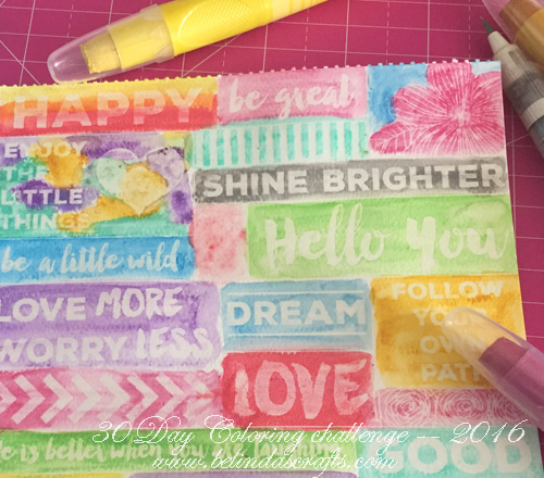 Another thing I liked about the crayons is they have a slight shimmer that appears after you apply water and remain after it dries. I did swipe my finger over it and a little residue does come off on your finger but no way near the amount that annoying glitter (my nemesis) does. I like how this page came out and look forward to practicing some more with more pages from the paper pad. One thing I didn’t like about them, is that when you color with them, they sometimes produce build up lumps that don’t blend and when you add water they just move around. Think like when you paint your nails and some lint gets trapped under the paint (annoying!!). But I think, with time I can manage that better.